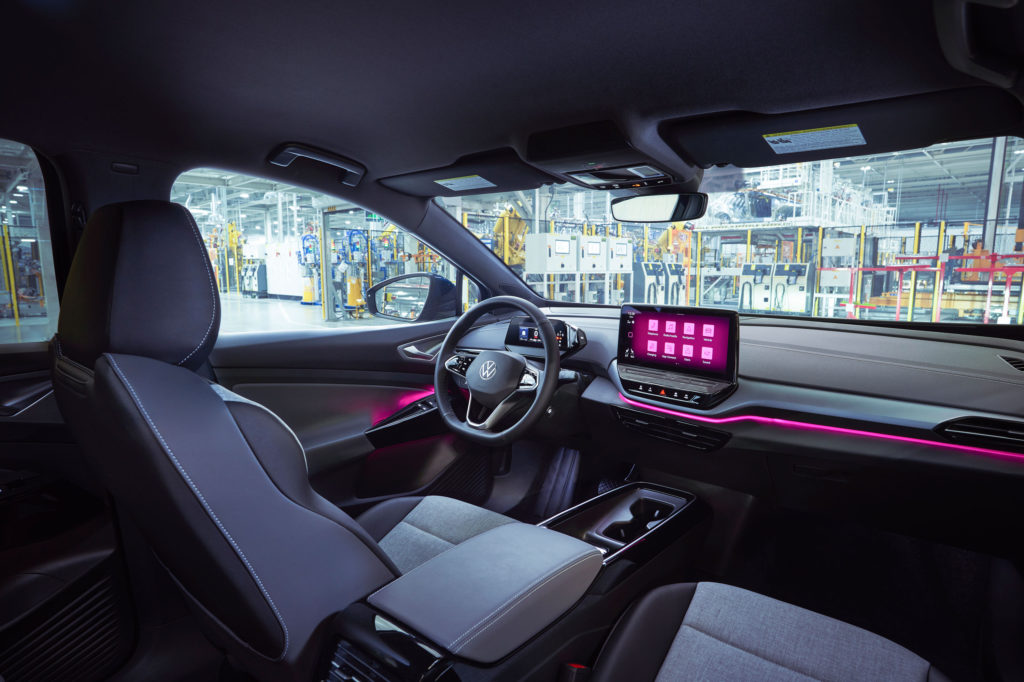
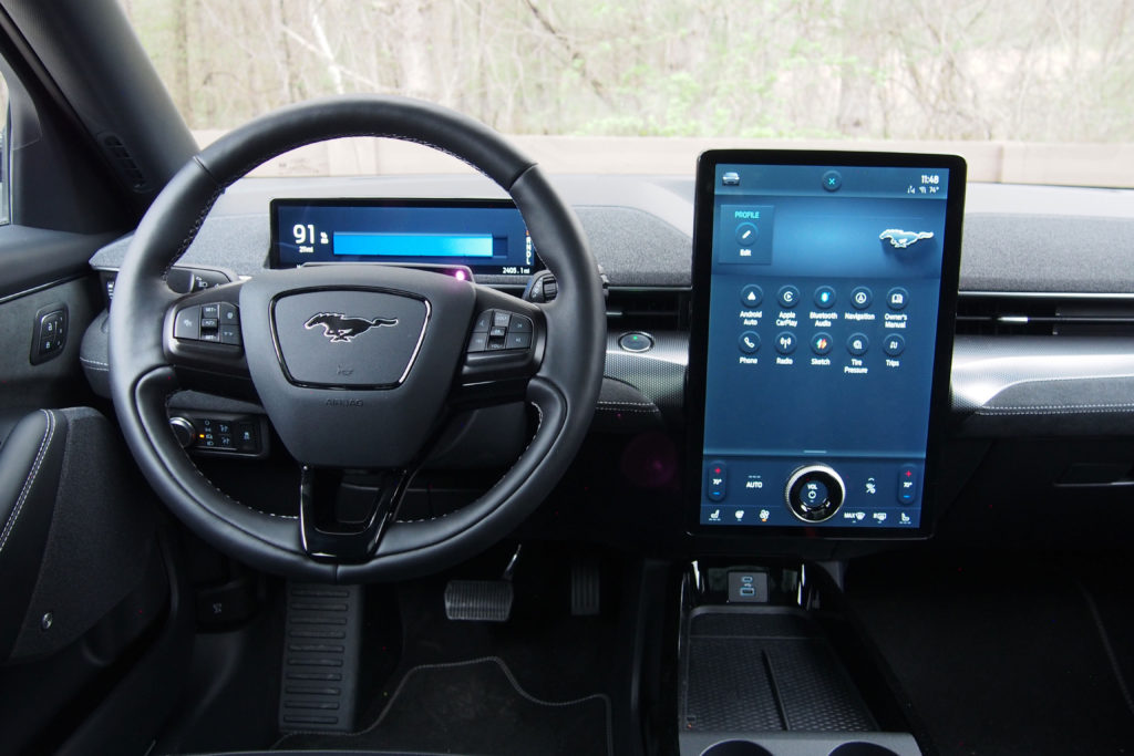
Technology is important. It’s what makes the future brighter and happier. But car interiors are no place for over-the-top razzle-dazzle. Things are getting out of hand.
It’s crazy. Thanks to internet-connected smartphones, we walk around with instant access to a huge chunk of all recorded human knowledge right in our pockets and purses. But at the risk of sounding like a neo-Luddite, automakers need to stop pretending they’re tech companies. It can be annoying and even dangerous.
I get it. Software and circuitry are mission-critical these days – you have to have this stuff to power navigation systems, hands-free driving aids, and electric vehicle chargers, but automakers, you are not Apple, Google or Samsung. You can’t – and shouldn’t – try to do what tech companies do.
Just because screens and touch controls are in vogue, just because people are infatuated with their phones and tablet computers doesn’t mean this sort of stuff belongs in a vehicle. When you’re piloting three tons of steel, glass and battery pack at 80 miles per hour on the highway, fumbling with a screen to turn on your seat heater is a bad idea.

Touch-sensitive steering wheel controls are often just as bad. Mercedes-Benz and Volkswagen use these in some of their products and they often don’t work well, even in the mega-pricey EQS SUV that we had in for testing a while back. Trying to adjust the audio volume with an unresponsive slider you can’t identify by feel, so you take your eyes off the road to find is not good.
SEE ALSO: EV advocates are lying to you!
Of course, some automakers are far more egregious than others. Take the Jeep Grand Wagoneer, for instance. It comes with something like seven screens inside, eight if you count the digital rearview mirror. Who needs that? Are customers asking for that many displays? I can’t imagine they are.
In the automotive space, the fetishization of technology has gotten out of hand – the need to have high tech gadgets just because it’s trendy is borderline perverse. Every interior surface does not need a display, not every single switch belongs in a touchscreen. There’s no need to reinvent the wheel here – traditional knobs and buttons are superior for things like climate controls.

Of course, conventional switches and dials can be bad, too, if they’re illogically laid out or poorly distinguished. The eighth-generation Honda Accord comes to mind. Its center stack looks like a Scrabble board, with way too many similarly sized and shaped buttons. Still, I think physical controls are superior for many vehicle functions. On the flip side, I am not opposed to digital instrument clusters or infotainment displays. In fact, touchscreens are amazing for navigation systems or media playback. It’s just that automakers take this stuff too far. I mean, what’s next, a voice-activated turn signal? Tesla Virtual cupholders? Pinch-to-zoom air vents? Oh, wait, that’s kind of already a thing.
CHECK THIS OUT: Tesla is the most vulnerable it has been in a long time
When it comes to technology, we need balance. Screens and touch interfaces are amazing for some things, but physical controls should still be used for certain functions, even if they’re considered old-fashioned.
